
Monday 23 April 2012
Thursday 22 March 2012

Monday 19 March 2012

Sunday 18 March 2012
Preliminary Exercise Front Cover
This is my preliminary exercise front cover
 I made this on Adobe Photoshop.

Prelimary Exercise Contents Page
This is my final piece of my contents page for my preliminary exercsie.
I made it on Quark XPress

I made it on Quark XPress

Saturday 17 March 2012
Evaluation Question 1
This is question 1 on the evaluation. In what ways does your media product use, develop or challenge forms and conventions of real media products?
I did this on Slideshare
I did this on Slideshare
Thursday 8 March 2012
Evaluation Question 2
Question 2:Who would be the audience for your media product? on Prezi
Question 2 of the evaluation was: how does your media product represent particular social groups.
I did this presentation of Prezi
Question 2 of the evaluation was: how does your media product represent particular social groups.
I did this presentation of Prezi
Tuesday 6 March 2012
Evaluation Question 3
Question 3 on the evaluation was what kind of media institution might distribute your media product and why?
I did this question on SlideRocket
Here it is:
I did this question on SlideRocket
Here it is:
Monday 5 March 2012
Evaluation Question 4
Question 4 on the evaluation was Who would be the audience for your media product?
I did the answer to question 4 on Xtranormal
question 4
by: lilygray01
This is an example of what people whom are in my target audience may wear and look like :


And here is examples of what they may wear:
Band tees
Vans
Hoodies
Skinny Jeans


Here are two examples of what people who will read my magzine will listen to:
I did the answer to question 4 on Xtranormal
question 4
by: lilygray01
This is an example of what people whom are in my target audience may wear and look like :

And here is examples of what they may wear:
Band tees
Vans
Hoodies
Skinny Jeans


Here are two examples of what people who will read my magzine will listen to:
Sunday 4 March 2012
Evaluation Question 5
Question 5 on the evaluation was: how did you attract/address the audience for your media product
I did this question on Prezi and individual Prezi's for each media product that i produced
This is my Prezi that I made for my front cover:
This is the Prezi I made for my contents page:
This is the Prezi I made for my double page spread:
I did this question on Prezi and individual Prezi's for each media product that i produced
This is my Prezi that I made for my front cover:
This is the Prezi I made for my contents page:
This is the Prezi I made for my double page spread:
Saturday 3 March 2012
Wednesday 22 February 2012
Evaulation Question 7
Question 7 on the evaluation was: looking back to your preliminary task, what do you feel you have learnt in the progression from it to your full product.
I answered this question on slideshare
I answered this question on slideshare
Question 7
View more presentations from LilyGRAY.
Friday 27 January 2012
Audience Feedback
I asked members of my target audience on social networking sites to tell me what they liked and disliked about my Final pieces.
 For my contents page I asked Gemma Kenny,
a 17 year old female,who goes to college and studies Psychology, English Language, Film Studies and Media. She also likes rock/punk music and enjoys going to concerts.
Upon seeing my contents page she said "I like the colours and the photos, the photos look very professional and like they should be in a real magazine. I also like the bands that are in the magazine, and the layout of the page is nice, I cant think of anything I don't like about it."
 For my double page spread I asked 20 year old Tom Stone, who is a shelf stacker in Tesco. He is in a band so likes going to gigs and he likes heavy rock and punk rock.Upon seeing my double page spread he said ""i like the colour contrast between the pink,white and black, the black background makes the pink and white text jump off the page and catch peoples eyes which draws them in. The font too, its different and stylish to make people want to read on. I love the pictures"
 For my Front cover I asked 23 year old waitress Kate Black who enjoys going to gigs and enjoys reading music magazines. Upon seeing my front cover she said " I like the main image as it portrays the genre of rock very well, i also like the title and the effects used to make it bolder and stand out more to the audience. I also like the plus part at the bottom as it seems like when we buy the magazine we are getting more for our money than with other magazines. I would also want to buy this magazine as I like the competition and I like the colour scheme"
I showed all my three final pieces to two more members of my target audience.
 I showed Abbie, a 15 year old student who has a passion for music and reads music magazines weekly. She said "its really good, the contents page in particular is good because the articles are split up into regulars and features like in professional music magazines. And the double page spread is good because I like the layout and the article and I love the live shots. Its like Kerrang magazine and Rock Sound have had a baby"
 I also showed Noah, an 19 year old college student the final piece. He said "I like the contents page more than the front cover and the double page spread, I like the layout of all three and they're all clear. I like the way the contents is divided up which makes it easier on the eyes. I also like how the colour scheme runs through from the front cover to the contents page and the colour scheme of the double page spread is eye catching."

a 17 year old female,who goes to college and studies Psychology, English Language, Film Studies and Media. She also likes rock/punk music and enjoys going to concerts.
Upon seeing my contents page she said "I like the colours and the photos, the photos look very professional and like they should be in a real magazine. I also like the bands that are in the magazine, and the layout of the page is nice, I cant think of anything I don't like about it."


I showed all my three final pieces to two more members of my target audience.


Thursday 26 January 2012
Production Of Double Page Spread
First of all I added my main image and the title and the background colour

Then I added my credits and my standfirst:

I added my article next:

Then I added my drop quotes:

I added my other image on my third page:

Then I added the article

I added my drop quote next:

Then my ending paragraph and my double page spread was complete.

Then I added my credits and my standfirst:

I added my article next:

Then I added my drop quotes:

I added my other image on my third page:
Then I added the article
I added my drop quote next:
Then my ending paragraph and my double page spread was complete.
Wednesday 25 January 2012
Production Of Contents Page
First of all I used my background colour for my front cover for the background colour of my contents page and then added the title contents and the title:


After this I added my regulars and my subscription details:

I then added my features:


After this I added my images and the page numbers for the images to anchor them. I did them in a box as I thought it looked neat. I also added the issue number and the issue date.

I then added my features:

Tuesday 24 January 2012
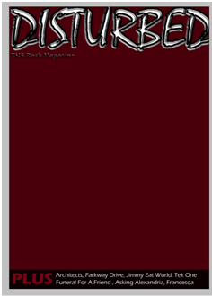
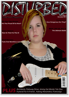
Production Of My Front Cover
I produced my front cover on Adobe Photoshop, this is the production stage of making my magazine:
I made the title using the text effects, the text effects I used were: Bevel and emboss and stroke. This is my title:


Next I added the box at the bottom which was to hold extra bands and stories and a buzz word to entice and encourage the reader to want to buy my magazine.I also added my positioning statement with the text effect of Bevel and emboss. I added this before my image so that my main image would fit in around everything else and I knew what space I had to work with:

Next I added my main image, originally I used a different image however it didnt fit the genre and it ddint look right so I took more pictures and found one with the right attitude and look to be on a rock magzine. The main image is slightly over the masthead however not too much as you can still read what the masthead says:
 After this I began to add my coverlines and sublines. At the start they were moved around a fair bit, this was because they didnt look right, I eventually however decided on their placings so it didnt look like there was too much plain space and it didnt look like there was more on one side than the other:

After this i needed to add the issue number, barcode, price and website of the magzine. Originally the barcode was in the top right corner but then I decided that it ddint look right and I couldnt find any other magazine that had this so the issue number went in its place and the barcode went to the bottom right corner:

I then added my main coverline and subline that connects to my main image on the magazine. the coverline also used text effects which were inner shadow, outer glow, satin, bevel and emboss and gradient overlay. I used all these to get the right effect to make the magzine look more professional. the subline used the effects: drop shadown, inner shadow, outer glow and bevel and emboss.

The only thing I had left to do was the fill the gap on the rigfht hand side of the main image. I filled this by outting a competition in its place. This filled the space nicely and completed my magazine front cover.

I made the title using the text effects, the text effects I used were: Bevel and emboss and stroke. This is my title:

Next I chose the background colour, originally I had wanted a blood red, however this did not look right or fit in with my music genre, so i went for a darker red, almost brown.

Next I added the box at the bottom which was to hold extra bands and stories and a buzz word to entice and encourage the reader to want to buy my magazine.I also added my positioning statement with the text effect of Bevel and emboss. I added this before my image so that my main image would fit in around everything else and I knew what space I had to work with:
Next I added my main image, originally I used a different image however it didnt fit the genre and it ddint look right so I took more pictures and found one with the right attitude and look to be on a rock magzine. The main image is slightly over the masthead however not too much as you can still read what the masthead says:


After this i needed to add the issue number, barcode, price and website of the magzine. Originally the barcode was in the top right corner but then I decided that it ddint look right and I couldnt find any other magazine that had this so the issue number went in its place and the barcode went to the bottom right corner:
I then added my main coverline and subline that connects to my main image on the magazine. the coverline also used text effects which were inner shadow, outer glow, satin, bevel and emboss and gradient overlay. I used all these to get the right effect to make the magzine look more professional. the subline used the effects: drop shadown, inner shadow, outer glow and bevel and emboss.

The only thing I had left to do was the fill the gap on the rigfht hand side of the main image. I filled this by outting a competition in its place. This filled the space nicely and completed my magazine front cover.

Monday 23 January 2012
Production- Images Taken For My Double Page Spread
This is a slideshare of the images I took for my double page spread and the images I used
Production- Images Taken For My Contents Page
This is a slideshare of all the images I took for my music magazine contents page.
Friday 20 January 2012
Production- Images Taken For My Front Cover
This is a slideshare containing the images I took for my music magazine front cover
Rough Layout Of Double Page Spread
This is a rough layout of my double page spread. It outlines where everything will be and the fonts and sizes I will be using.


Rough layout Of Contents Page
This is a rough layout of my contents page that I did on A4 paper. It outlines the fonts and sizes I am going to use and where everything will be placed.


Rough Layout Of Front Cover

Saturday 19 November 2011
Production- Article.
This is my article that I wrote after my interview
We caught up with James and his band Deaf Havana after their sold out headline gig at the Liverpool Masque on October 20th, in a dark, dingy practice room.
The atmosphere in the room was high, and the band were in high spirits “There’s just no
better feeling that we can get after playing to a sold out venue, it’s just amazing being able to connect and reach people with our music” James explained about the bands spirit.
The band have just been touring with You Me At Six and Lower than Atlantis “The You Me At Six tour was amazing, we are good friends, and we just had a great time, we felt honoured to be playing with them”. The large venues are never what the band expected to be playing. Deaf
Havana are a band from a small village near Kings Lynn, Norfolk. “We started out playing in a shed at the bottoms of Ryan Mellors (former front man)’s garden, we then started trying to get more shows, getting more and more tours under our belts” James explained about the band journey into the music industry, since being in the music industry they have released 7 EP’s and 1 album since 2005, however the new album “Fools And Worthless Liars” is going to be Deaf Havana’s debut album as they call it. “We have had to mature as a band and adapt to changes in the band since 2009’s Meet Me Halfway, At Least and we want people to treat us as a new band”, drummer Tom Ogden
explained. The changes that the band have had to adapt to was the departure of former vocalist and screamer on May 10 2010 due to personal problems, the band reacted as well as they could to this news “We realise its for the best that he went and sorted out his personal problems that made him leave the band and we had to carry on as a 4 piece, we still talk to him and he has been to see us a few times at gigs.” Tom told us. Its refreshing to see a band who are so upbeat about a departure of a member, its even better to see a band who are strong enough to carry on and adapt to a different style of music and not replace the screamer, as this doesn’t happen often. “We decided it was better to not replace him, we saw him leaving as an opportunity for us to change our music style, some people may say that it was a bad decision but we stand by it as the best thing to do for us to become a stronger band” Lee Wilson, bassist explained. The new music style that Deaf Havana went for was a lighter rock, as James Veck-Gilodi who previously shared guitar duties with Chris Pennells, had to step into the spotlight and become the front man, “Since Ryan left, I have found it a lot harder being the front man , that is never what I wanted to do, never in a million years, I’m so much happier being in the background playing guitar, I’m not used to the attention I get as a front man” James explained. But people clearly love the new, “improved” Deaf Havana, as the gig tonight sold out within a few weeks, “Selling out a venue feels amazing, it feels like all our hard work is paying off and people do appreciate what we do” Lee explained, with a grin across his face.
In December 2010, last time the band visited the Masque they played a new song called “Down Syndrome Pigs”, one of the first songs without Ryan, this song was a sign of things to come, the band were ready to start work on the new album, “Well I never wrote lyrics before in this band or ever, so I wanted to look at experiences that I’ve had and write the most honest lyrics that I could, plain simple and personal, so people could relate to them” Veck-Gilodi explained when asked about the experience of having to write lyrics for the first time for the new album and for the B-sides released in Spring 2011. The band say that their main musical influences are Morrissey, Poison The Well, Killswitch Engage and also surprisingly Lady Gaga “Lady Gaga’s album is fantastic, Some of the tunes are so catchy and every song is so different” said Lee, with no hint of shame. A band that takes influence from Lady Gaga, the new album will be different for sure. It can be argued that Deaf Havana are a band who have changed from a screamo/metal band into a medium/light rock band and if that songs released “I Will Try and Home Sweet Home” are anything to go by, the new album will for sure blow everyones socks off.
In a few weeks, on November 7th, the debut album “Fools And Worthless Liars” is going to hit the shelves. This album saw Deaf Havana leave A Wolf At Your Door Records and be signed to BMG and work with producer Matt O’Grady who has also worked with You Me At Six. “It feels a lot better being singed to a major label, we still have the e same amount of say in what goes into our record, it feels like we’re being welcomed into a new family, it’s what we as a band needed” James explains. The artwork for “F.A.W.L” came out in summer and there were many rumours about who the child was on the front of the album, many fans were claiming it was James in his younger years “ Right no it’s not anyone of us, its about the second track on the album ‘Youth In Retrospect’and the child has a briefcase to show that one minute you’re young without a care and the next you’re all grown up and in a full time job, and it seems like your life is wasting away before your eyes.” James says, his face breaking out into a smile at his clever idea for the front cover. This was indeed an idea that only a band with this imagination and creativity could come up with. So what can readers expect from what is tipped to be the best rock album of 2011? “Expect something different to what they have seen before with us, we have matured as a band since the last album (2009’s Meet Me Halfway, At Least). I hope fans like it ,we have tried hard to make a record that will show our fans and new listeners who we really are.” Tom said, brimming with excitement at the thought of the 7th November. Many bands wouldn’t be able to have struggled with the pressures of the music industry, the loss of close friends and family, the loss of a front man and to come out of it stronger and with a bright future in front of them, they are a band for unsigned artists to look to and aspire to be like. So what’s the future through James’ eyes “Getting this album out and hoping for the best, If people appreciate it and we can keep touring and producing more music, who knows we could be the next AC/DC, man lets hope for that” Deaf Havana are a band who is dedicated to getting people to hear their music and reaching people though the power of music. They are constantly touring, the tour that they are on now has just came straight after the You Me At Six tour and saw Deaf Havana’s last headline gig of the year in England before they head off to Ireland, and they most certainly went out on a bang and left the audience wanting more. So when will we see them next in England “We are touring with our good friends Architects in December and then in Spring of next year we have some dates lined up but nothing is confirmed yet” it seems that fans don’t need to wait long to see this band again. Dedicated is the word to describe them.
After the chat, a few beers and games of twister later, the band begin to pack up, it’s
midnight and there is still fans waiting outside clutching their posters and tickets to be signed by the band who they have been inspired by. Each member signs the tickets and merchandise, poses for pictures, the fans look ecstatic and the band look humbled that their music has made an impact on these young people. “Without our fans we wouldn’t be touring, we wouldn’t have the ability to be making money doing what we love doing. We are incredibly lucky to have made it this far, and we thank everyone of our fans for buying tickets, buying a top, coming and telling us that they like our music, you have no idea how much we appreciate it and we love you all” James says, whilst he holds his three band mates close, the band then get into the van and set off for Ireland to promote the new album
This is a band who I have a feeling will be the next big thing, they have no idea how good they are and how much people adore their down to earth friendly attitudes. There has not been a band in a while who have appreciated their fans and the chances they have been as much as these guys. I look forward to seeing them headlining Download in a few years.
Friday 18 November 2011
Article Research
Before I did my interview with Deaf Havana on the 20th October 2011I used Wikipedia to help me with background information on them:
http://en.wikipedia.org/wiki/Deaf_Havana
I then composed all my questions to ask them. These were the questions that i asked:
http://en.wikipedia.org/wiki/Deaf_Havana
I then composed all my questions to ask them. These were the questions that i asked:
Unlike most other rock bands non of you have gone off the rails, how has this happened?
If you could give a younger version of yourself some advice what would it be?
Who is the child on the album cover, there’s been rumours that its you james...
What are your five essentials to take on tour?
How’s the chemistry in the band?
If you weren’t in the band what would you be?
When are you guys next on tour?
Who are some of your musical influences and how have they impact the music you are creating?
In terms of the actual songs, what did you find yourself writing about? The newer songs seem to have very personal lyrics.
What can listeners expect from your new album, fools and worthless liars?
Do you think you have matured from your first EP Sweet Sunset in 2005 to now, if so do you think its for the better or for the worse?
What do you all get from being in the music industry?
Is there any new and unsigned bands that you are a fan of?
You all seem so confident on stage when your playing to hundreds of people, how do you do it?
Don’t you find it daunting?
You have toured with the blackout, kids in glass houses, you me at six and the blackout just to mention a few, who was the best to tour with?
Who would you love to collaborate with?
How does it feel when you sell out a venue?
Whats the next step of your career?
What genre would you say your music is?
I’ve seen you guys a few times now, and you’re always willing to stay and talk to the fans after the gig, how much do you value your fans?
You also just signed to BMG, and went away from A Wolf At Your Door Records ,what's it been like having a major label involved?
Who are some of your musical influences and how have they impact the music you are creating?
How does the process of creating a song come about?
What was the last album you listened to and what were your thoughts on it?
How did your journey into the music industry begin?
How did you guys feel when ryan left?
Why didn’t you replace ryan?
Wednesday 16 November 2011
Planning Production
Over the last few lesson we have been coming up with the planning production. This is my planning production.
Planning production
Image for the front cover:
Connotations of rock
· Guitars
· Skinny jeans
· Eyeliner
· Converse
· Band tops
· Black/ bright hair
· Not smiling
· Piercings
· Tattoos
My main image on my front cover will be of a girl with a side fringe which is a typical rock star look, the person will be wearing eye liner and have pale skin and will be holding a guitar. They will also be wearing a black top. This picture will have connotations of rock.
Coverlines and sublines for the front cover:
Coverlines in bold, sublines not
· Dangerous- how dangerous are dangerous?
· Enter shikari- OK so now it’s time for our plan b
· Blink 182 vs. my chemical romance- the ultimate battle
· We are the ocean- Are you proud of us now?
· Deaf Havana- We're all fools and worthless liars
Text for the contents page:
Masthead: Disturbed! contents
To go underneath the masthead: Issue 1...Cover date: 23/11/2011
· News: lower than atlantis and falling in reverse
· Feedback: young guns and parkway drive.
· Live reviews: funeral for a friend, the blackout, Canterbury, bunny the bear.
· Gig guide: architects, Canterbury and lost prophets.
· Album reviews: you me at six, megadeth.
· Posters: Foo Fighters, Evanescence and Avenged Sevenfold.
· Singles of the week: Jimmy Eat World, exit ten, coheed and cambria
· Famous last words: billie joe Armstrong from green day faces our toughest quiz yet!
PAGE NUMBERS
· News: page 5-7
· Feedback :page 3 and 4
· Gig Guide: page 110-115.
· Album reviews: page 101- 104
· Features: WATO: page 89
Deaf Havana: page 69
Francesqa: page 44
BMTH: page 50
Linkin Park: page 96
30STM: page 105
Madina Lake: page 30
Metro Station: page 70
AC/DC: page 48
Yashin: page 108
All time low: page page 40
Dangerous: page 64
Enter shikari: page 32
Blink 182 vs. My chemical romance: page 82
Competition: page 72
The king blues: page 78
Panic at the disco: page 49
Asking Alexandria: page 86
· Singles of the week: page 100
· Famous last words: page 129.
· Posters: pages 20-26
· Live reviews: The blackout: page 9-10
Funeral for a friend page 11-12
Canterbury: page 13
Bunny The Bear: page 14
Subscription details
12 issues of disturbed for the price of 9 issues. Call 01456 562 222 quoting “rofg” to claim this offer, or visit our website www.disturbed.com and enter the discount code “rofg”. This offer is only available for a limited time only.
Images for the contents page:
- Of sophie Moran who is also the main image on my front cover
- Of James Veck-Gilodi from Deaf Havana which is what my double page spread is about
- Pavilions a local band
- Lower Than Atlantis front man Mike Duce who is featured in Live Reviews
Friday 4 November 2011
Publication Plan
In todays lesson we came up with a publication plan which contains all our decisions for what will go inside our magazine.

Publication plan
Title: Disturbed.
Positioning statement: THE rock magazine
Frequency of publication: Monthly
Price: £2.50
Distribution: Newsagents and supermarkets and alternative clothes shops.
Rationale: The approach of the magazine will be from the readers/fans perspective. We will ask questions that they themselves would ask and also questions which answers what they may have always wanted to know, the articles and everything in the magazine will be based about music and the bands involved.
Style: The style of the magazine will be informal and to the point. It will use humour and slang that will appeal to the target audience, it will use words that the target audience will understand about music and musicians. It will be humorous and to the point, with short paragraphs with the key words and phrases in bold or italics.
Images will be the feature of layouts.
Regular content:
· Editors letter
· News
· Feedback
· Live reviews
· Gig guide
· Album reviews
· Singles of the week.
· Posters
· Famous last words (quick quiz with a different icon every week)
Feature content:
· Madina lake- how the leone twins have made it through hell and back
· 30 seconds to mars- about the future
· Panic at the disco- the new album and the new tour and a new us.
· Slipknot- iowa 10 years on
· Competition- win two pairs of tickets to see machine head in december.
· Deaf havana- We are all fools and worthless liars.
· Black Veil Brides- Who are the fallen angels?
· Bring me the horizon- will it end?
· A day to remember- the tour to remember
· AC/DC- the end of the beginning or the beginning of the end
· Yashin- talk about the past, present and the future.
· Dangerous- how dangerous are dangerous?
· Metro station- a future with or without trace
· Linkin park- revelations about the past
· The king blues- plans on reform
· Francesqa- the true meanings behind our songs.
· Asking Alexandria- our favourite bands and songs.
· All time low- Alex opens up about his musical past.
· Bowling for soup- What music means to us.
· We are the ocean- Are you proud of us now?
· Enter shikari- OK so now it’s time for our plan b
Colour scheme: red, white and black.
House Style
Front Cover
Cover lines will be size 16pt
Will be in font Eras Bold ITC
Sub lines will be size 14pt
Will be in font Eras Demi ITC
Extra and names along the bottom will be in size 18pt
And will be in font Eras Medium ITC
The word plus at the bottom will be in Eras Bold ITC
And in size 48pt
Contents page
Titles of regulars and features in font Impact
In size 28pt
Stories and subscription details will be in font Ariel
In size 9pt
Titles of stories will be in font Bell Gothic Light
And in size 12
Double Page Spread
Title is in font Chiller
In size 85pt
Article is in font Ariel
In size 9pt
Drop caps are in Ariel
In size 24pt
Stand first is in font Ariel
In size 16pt
The title was made on Photoshop.

Subscribe to:
Posts (Atom)