Friday 30 September 2011

Preliminary Exersize Final Images/Photographs For Contents And Front Cover page

In todays lesson we had to go out and take pictures for the front of our school magazine front covers and for our contents pages. Any pictures we used had to be original and taken by us.

I had to take one photograph for my front cover which will be the main image for the front cover, it will take up most of the front cover and is a picture of a student holding up their exam results. The shot used is a mid shot.
I then took four images for my contents page, each of these pictures will be anchored to a story, the first picture i took was of the revison material (folders, paper, pens)it looks chaotic, to reflect the key years when pupils have exams and to reflect what they feel mentally. It was a close up of the materials so will be achored to the article about revision tips, the second picture i took was of the media room, this image will anchor the story about the new media facilities and the shot used was a medium long shot. The third image I took was of the map of the world on the wall and the two pupils pointing at different places on the map. This image will anchor the article about the trips and "globetrotters". This image was a two shot that was taken at a medium long/long shot.The final image i took for my contents page was a group mid shot of three people holding exam results, this is to anchor to the story about this years exam results and the big successes.

This is the image for my front cover.


This is the image for the contents page that will anchor the revision tips article.


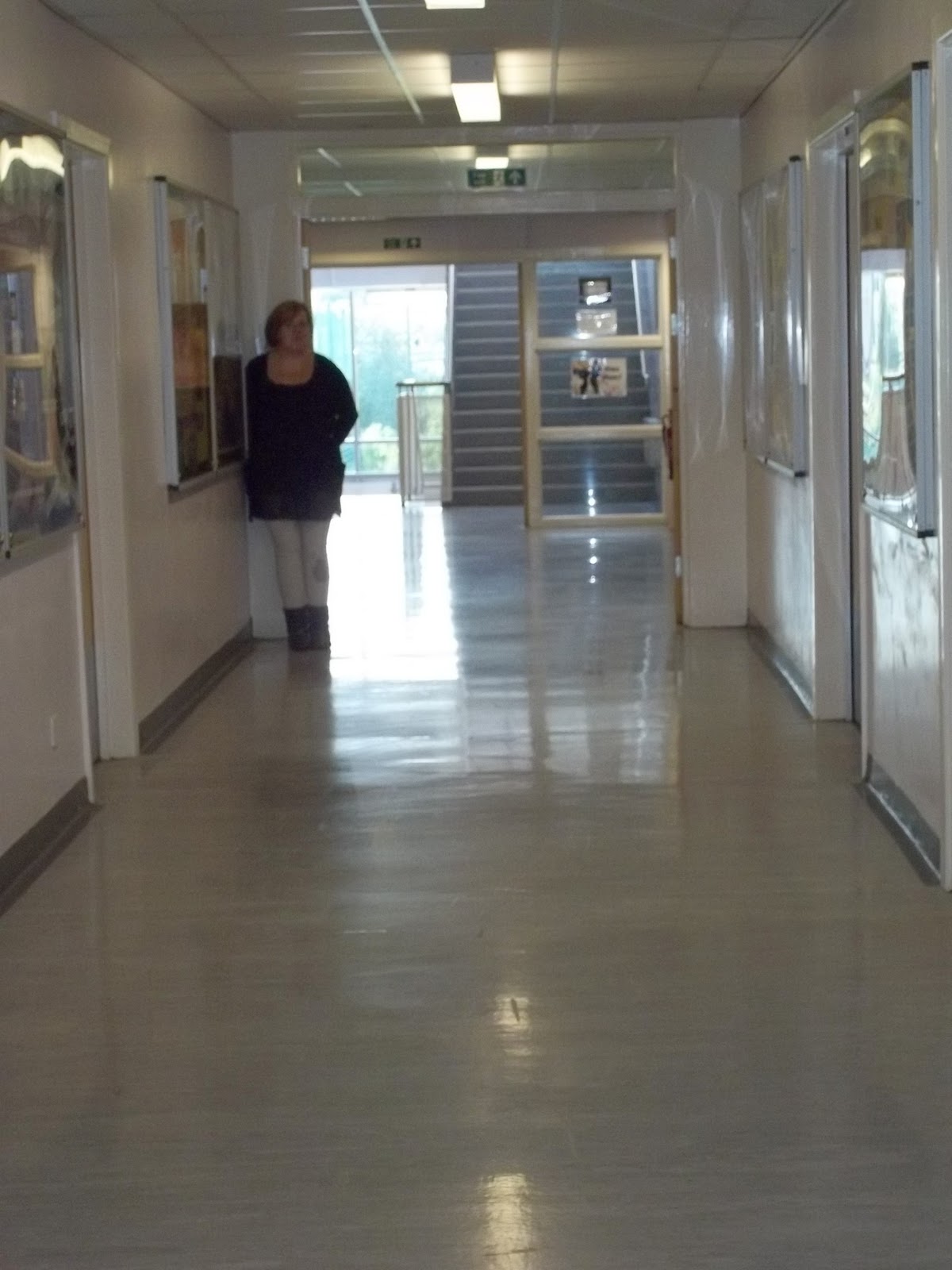
This is the image for the contents page that will anchor the story about the new media facilties.


This is the image for the contents page that will anchor the story about the "globetrotting".


This is the final image for the contents page that will anchor the story about this years exam results.


Tuesday 27 September 2011

Preliminary Exercise Rough Layout For Contents Page

In todays lesson we made a rough layout of our magazine contents page


Rough layout of my contents page


Preliminary Exercise Planning Content

Regular features in magazine:

  • List of clubs and activities
  • Dates of school events
  • Dear dorothy
  • Whats on in the canteen
  • Subject ambassadors, what they think of their subject.
  • Whats on iris this month
Feature articles:
  • Exam results special GCSE and A-Levels.
  • Ten tops tips for revision article
  • New management for the school, meet the team
  • Find out how past pupils are doing
  • Where we're jetting off to
  • New school catering team- what they hope to bring to the school.
  • School buys farm for GCSE animal care students.
  • New media facilties.
  • New exchange student programme- students go all oevr the world.
  • Year 7's and how they are fitting in.

Images to use for contents page.

  • Students holding results with smiles on their faces, mid shots, taken in school reception for exam success article
  • Folders and pens for revision tips article.
  • Picture of media room for media facilities article
  • Picture of two students pointing at different places on a world map

Preliminary Exersize Rough Layout For Front Cover

In todays lesson we  made drafts on paper of what we want our magazines to look like.
    Rough layout of front cover.


      Preliminary Exercize Plans For Front Cover

      Plans for the front cover

      Title for magazine: The Richmond Reader

      Positioning Statement:  Be cool,be smart

      Details of the mis-en-scene:

      •  My magazine will have 5 coverlines on the front.
      • The masthead will be extended across the top of the top of the magazine.
      • The positioning statement will be underneth the masthead on the right hand side.
      • The name of the magazine "the richmond reader"  is alliteration and has a certain ring to it, it is also including the name of the school, which is essential to the school magazine brand.
      • The barcode will  be in the bottom right hand corner.
      • The issue number, date the issue came out and the price of the issue will be underneth the masthead and on the left of the positioning statement.
      • My main image on my magazine will be a mid-shot image of a girl holding exam results, she will be stood in the school reception foyer.
      • The colour scheme for my magazine will be royal blue and white as this is the schools uniform colours.
      • Pictures on the front of my magazine will be anchored to the coverlines and the stories within.
      • I will use a buzz word across the bottom of the magazine front cover, the word "plus" is being used to make the reader feel like they are getting more for their money.

      Coverlines for the front cover of my magazine:

      My school magazine will have 5 coverlines and all of the coverlines will have a subline underneth to help explain what the story is
      • Ten top tips for revsion- put together by past students
      • Smashing school meals- New catering company.
      • Marvellous new management- New head and leadership team.
      • Free food voucher- To reedeem read t&c (terms and conditions)
      • Globetrotters guide- Where we're jetting off to.

      Monday 26 September 2011

      Practice Shots And Descriptions

      Today we  looked at different camera shots and different camera angles.
      We took 12 different pictures all with different camera shots.
      We used a mixture of long shots, close ups and mid shots all at different angles.

      The first shot was a low angle medium close up- a medium close up focuses on the chest and head.


      The second shot was a high angle long shot- this is when the camera is held above the
      subject and the long shot is used to get the whole of the subject in.


      The third shot was an extreme close up of the time-focuses on one main thing and not any background is shown, this picture was taken to only show the time.


      The fourth shot i did was a big close up of someone using a mobile phone- a big close up shows the face only and only little of the background


      The fifth camera shot i did was a close up of someone in "nature'' A close up focuses mainly on the head and some of the shoulders and shows some of the surrounding area


      The sixth camera shot used was a two shot in medium long shot.This shot has two subjects in and is a medium long shot, which means that their upper body is in the picture.


      The seventh camera shot used was an over the shoulder shot of someone writing.An over the shoulder shot is simply a picture taken of someone from over their shoulder to see what they are doing, in this case the subject is writing.


      The eighth camera shot used was a very long shot conveying isolation- a very long shot is one that is taken a fair distance away from the subject, it should show the whole of the subject and the area surrounding them. I think this photograph conveys isolation well as the subject is isolated from the surroundings. they are on their own.


      The ninth camera shot was a medium close up- a medium clsoe up is one that focuses on the shoulders and the head of the subject in the photograph.


      The tenth camera shot was a long shot- a long shot is used to get the whole of the subjects body in,and show the size of the subject involved.


      The eleventh camera shot was a photograph which has connotations of friendship I used a picture of two people holding hands to portray the love and strong connection between the best of friends.


      The final shot used was a photograph which has connotations of stress. I used a picture of someone olding a crumpled strectched piece of paper, as i feel this reflects the midset of someone when they are stressed.


      Friday 23 September 2011

      Codes And Conventions Of Music Magazine Contents Page.

      In todays lesson we looked at a variety of contents pages and at the codes and conventions of music magzine contents pages.I found out that:

      Images
      • There is usually one main image that dominates part of the contents page.
      • The main image always relates to the main article of that certain issue of the maagzine.
      •  The subsidery images are different sizes and shapes.
      • The images are anchored by the page numbers and teh page numbers anchor the story.
      • There is usually 3 to 6 subsidery images on the contents page
      Text and font.

      • The coverlines are usually the names of the bands or article, this is normally short and snappy sentances.
      • The text of the coverlines is in bold to stand out to the reader.
      • The page number always comes before the story.
      • There is always a line gap inbetween the two main sections on the contents page: regulars and features.
      • There is also line gaps between stories, so the reader knows where one story starts and the other one ends.
      • The size font on the coverlines in usually 12 or 13 point,and is usually in a roman font.
      • The substory font is usually 11 point and in the same font as the coverlines.
      • There is usually an editors letter on the contents page.
      • One font is used for all the text on the contents page, bar the title which is in its own unique font.
      • The title of the magazine is usually across the top of the contents page, this is to re-establish the magazines brand.
      • The word "contents" is usually below or next to the magazine title at the top of the page.
      • The title of the magazine and contents is in the same font and is bold and large.
      • There is clear consistent font usage, maximum three font types used.
      Layout
      • The colour scheme is consistent throughout the magazine, this is done to maintain the brand.
      • The background is usually plain, this is to help make the images and the texts stand out.
      • The contents page is usually split up into two or three columns.
      • Credits for the person who took the main image is featured down the side of the page.
      • The layout is kept as simple as possible, so not to confuse the reader.
      • The website, contact details and an address of the publisher is also featured on the contents page.
      • The issue number and the date of the magazine is also shown by the title of the magazine and the word contents.
      Examples of contents pages.

      Thursday 22 September 2011

      Codes And Conventions Of Music Magazine Front Covers.

      In lesson today we looked at a variety of magazine front covers and came up with a group of codes and conventions and we also looked at where everything was placed on the front cover and we will use this to decide what how we will lay our magazine out, and what should be on the front of the magazine

      Images
      • There is always one main image on the front of the magazine, and a couple of subsiduary images are also used which are alot smaller than the main image.
      • The subject/s of the main image are to be looking the camera,so direct adress to the audience is given.
      • If the image is only of one person then the camera shot used on the main image should be a medium close up or a mid shot, this is so the camera is showing the whole of the face and to have the focus on the face.
      • If the image is however, of more than one person, for example a full band then the camera shot should be a medium long shot or a long shot, this is used to get all the members in.
      • The body language and facial expression of the subject/s in the main image must reflect and fit in with the genre of music the maagzine is about. For example: the main image of a popstar cant be the subject snarling and slouched over.
      • The background of the front of the magazine should be plain and not complicated.
      • There should be a colour scheme of no more than three or four colours.

      Title and font
      • The title, also known as the masthead , is a large, bold and unique font that is not used anywhere else in the magazine.
      • The title and the font used for the title must reflect the genre of magazine.
      • The title if more than 4 letters should stretch right across the top of the magazine from the left to the right.
      • The title, shouldn't be covered by the main image unless the subject in the main image is a well established person or if the magazine is a well established one that people will recognise the title even if one or two of the letters is covered up.
      • There should be 5 coverlines featured on the magazine at least, and they should all be in the same font.
      • The text should always relate to a story inside the magazine or an image on the front.
      • No more than 4 fonts should be used on the front cover.
      • Buzz words such as: exclusive and plus make the reader feel like they are getting more for their money or they are getting something that no-one else has seen.

      Barcode
      • The barcode is usually in the bottom right hand corner, but can also go anywhere on the right hand side
      • Around the barcode is the issue number, the issue date, and the price of the magazine,and a website for the magazine
      Examples of magazine front covers