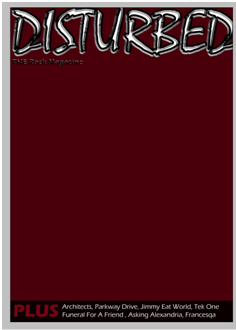
I made the title using the text effects, the text effects I used were: Bevel and emboss and stroke. This is my title:

Next I chose the background colour, originally I had wanted a blood red, however this did not look right or fit in with my music genre, so i went for a darker red, almost brown.

Next I added the box at the bottom which was to hold extra bands and stories and a buzz word to entice and encourage the reader to want to buy my magazine.I also added my positioning statement with the text effect of Bevel and emboss. I added this before my image so that my main image would fit in around everything else and I knew what space I had to work with:
Next I added my main image, originally I used a different image however it didnt fit the genre and it ddint look right so I took more pictures and found one with the right attitude and look to be on a rock magzine. The main image is slightly over the masthead however not too much as you can still read what the masthead says:


After this i needed to add the issue number, barcode, price and website of the magzine. Originally the barcode was in the top right corner but then I decided that it ddint look right and I couldnt find any other magazine that had this so the issue number went in its place and the barcode went to the bottom right corner:
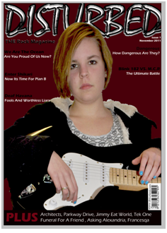
I then added my main coverline and subline that connects to my main image on the magazine. the coverline also used text effects which were inner shadow, outer glow, satin, bevel and emboss and gradient overlay. I used all these to get the right effect to make the magzine look more professional. the subline used the effects: drop shadown, inner shadow, outer glow and bevel and emboss.

The only thing I had left to do was the fill the gap on the rigfht hand side of the main image. I filled this by outting a competition in its place. This filled the space nicely and completed my magazine front cover.

No comments:
Post a Comment